“You gotta have style. It helps you get down the stairs. It helps you get up in the morning. It’s a way of life. Without it, you’re nobody,” said fashion icon Diana Vreeland. This timeless wisdom shows why matching colors in your clothes is so important.
Getting dressed shouldn’t be like solving a puzzle. Yet, many people find it hard to create outfits that look good and planned. The key is to know how different colors work together to create visual harmony that boosts your confidence.
Whether you’re creating a capsule wardrobe or trying bold combinations, learning these basic techniques can make any piece stand out. You don’t need a big budget or natural talent. Anyone can master these skills with the right knowledge and practice.
This guide will show you five proven methods that professional stylists use every day. You’ll learn how to mix and match with confidence. This way, you can create outfits that show off your personality while looking put together.
Key Takeaways
- Master five essential color matching techniques for successful outfit coordination
- Learn how to combine 1-7 hues harmoniously in any ensemble
- Discover styling tips that work for any budget or wardrobe size
- Build confidence through understanding fashion coordination principles
- Create standout looks that reflect your personal style
- Transform ordinary pieces into polished, intentional outfits
Understanding Color Theory Basics for Fashion Success
The secret to easy fashion coordination is knowing how colors work together. Once you grasp this, picking outfits becomes simple. Your wardrobe turns into a tool for styling.
Color theory is your guide to looks that highlight your best features. Stylists use it every day to create stunning outfits. The good news? You can learn these basics too.
The Fashion Color Wheel Explained
The color wheel is your visual guide for color matching. It shows colors in a logical order, making styling easier. This tool helps you avoid guessing when choosing colors.
Complementary colors are opposite each other on the wheel. They create striking contrasts. Think red and green, or blue and orange.
Adjacent colors blend well together. For example, blue into blue-green, then green. These colors make looks peaceful and sophisticated.
The color wheel also shows triadic relationships. Colors equally spaced around the wheel form balanced combinations. These schemes offer variety while keeping looks harmonious.
Warm vs Cool Undertones and Your Personal Palette
Everyone has warm or cool undertones in their skin. This affects which colors make you look good. Knowing your undertones changes how you dress.
Warm undertones look great in earth tones and golden colors. Think autumn leaves and sunset hues.
Cool undertones shine in jewel tones and icy colors. Winter landscapes and ocean colors are perfect for these undertones.
Some people have neutral undertones, mixing both warm and cool. They can wear a wide range of colors. But, they should know which temperature family works best for certain occasions.
Primary, Secondary, and Tertiary Colors in Your Wardrobe
Primary colors—red, blue, and yellow—are the base of all colors. They make bold statements in your outfits. Each primary color adds its own energy.
Secondary colors come from mixing two primaries. Orange is red and yellow, green is blue and yellow, and purple is red and blue. These colors are vibrant and eye-catching.
Tertiary colors mix primary and secondary colors. Examples include red-orange, blue-green, and yellow-green. These shades add depth and interest to your outfits.
Building your wardrobe with these colors in mind makes coordination easy. Start with a primary or secondary color, then add tertiary shades. This way, your pieces will work well together.
Remember: Color theory is a guide, not strict rules. It lets you experiment while keeping your outfits appealing. Your personal style should always show through your color choices.
How to Determine Your Best Colors Based on Skin Tone
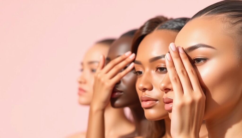
Your skin tone is key to a wardrobe full of colors that make you shine. Knowing which outfit colors match your skin changes how you dress. The right colors can make your skin glow and boost your confidence.
Many struggle with color choices because they don’t know their undertones. Finding this out makes choosing colors easier. Here are some ways to find your perfect color palette.
Finding Your Undertone Using Simple Tests
The white shirt test is the best way to find your undertones. Hold a white fabric or shirt against your face in daylight. Look in the mirror and see how your skin looks against the white.
If you look vibrant and healthy, you have cool undertones. Your skin has pink, red, or blue undertones that go well with cooler colors. If white makes you look yellow or sallow, you have warm undertones with golden or peachy skin.
If you can’t decide, you might have neutral undertones. This means you can wear both warm and cool colors well.
Your hair color also gives clues about your undertones. Light blonde hair usually means cool undertones. Golden or strawberry blonde hair suggests warm undertones. These styling tips help confirm your undertones from the white shirt test.
Another quick test is to look at your wrist veins in natural light. Blue or purple veins mean cool undertones. Green veins mean warm undertones. If you see both, you’re likely neutral.
Selecting Flattering Colors for Different Complexions
Cool undertones look great in jewel tones and colors with blue bases. Think emerald green, sapphire blue, deep purple, and true red. These colors make your skin glow without clashing with it.
For cool complexions, try these winning combinations:
- Navy blue with crisp white
- Emerald green with silver accents
- Deep purple with cool gray
- True red with black
Warm undertones shine in colors with yellow or orange bases. Golden yellows, warm oranges, rich browns, and coral shades enhance your natural glow. These outfit colors bring out the warmth in your skin.
Warm complexion color recommendations include:
- Camel brown with cream accents
- Coral pink with gold details
- Olive green with warm beige
- Burnt orange with chocolate brown
Neutral undertones can wear both warm and cool colors. Focus on colors that make you feel confident and radiant.
Remember, lighting affects how colors look on your skin. Always test outfit colors in natural daylight. These styling tips will help you find colors that enhance your beauty and create a cohesive wardrobe.
Essential Color Matching Rules Every Stylish Person Should Know
Color coordination becomes easy when you follow key rules that stylists swear by. These guidelines help you create outfits that look planned, not random. Learning these basics will make your wardrobe cohesive and stylish.
Think of these rules as your guide to fashion coordination. They give structure while letting you be creative and express yourself.
The 60-30-10 Color Distribution Rule
The 60-30-10 rule is a golden standard in color matching. It says use one color for 60% of your outfit, another for 30%, and an accent color for 10%.
Your main color goes on big pieces like pants or dresses. The secondary color is for smaller items like blazers or shoes. The accent color adds a pop with accessories like scarves or jewelry.
For a contrasting look, try the 70-30 rule. This means one color is dominant, and the other adds interest. It balances without being too much.
“The best-dressed people understand that successful style is about proportion, not perfection.”
Using Neutrals as Your Foundation
Neutral colors are the core of smart fashion. Shades like white, beige, gray, brown, and black work well together. These colors never clash, making them great for mixing.
Neutrals are your safety net. They’re perfect when you’re unsure about color matching. They also let bold colors stand out when you want to make a statement.
Begin with a neutral base, then add colors gradually. This keeps your look balanced and stylish.
When to Break Traditional Color Rules
Rules guide you, but don’t limit your creativity. Knowing when to break color rules shows confidence in your style. It’s about understanding the reasons behind the rules before you break them.
Break rules for special occasions or to show your unique style. Try unexpected color combinations. Trust your instincts when a mix feels right, even if it’s unconventional.
But keep some anchor points. Even bold outfits need a neutral element or a unifying color. This keeps the look cohesive and creative.
Step-by-Step Guide to Creating Harmonious Color Combinations
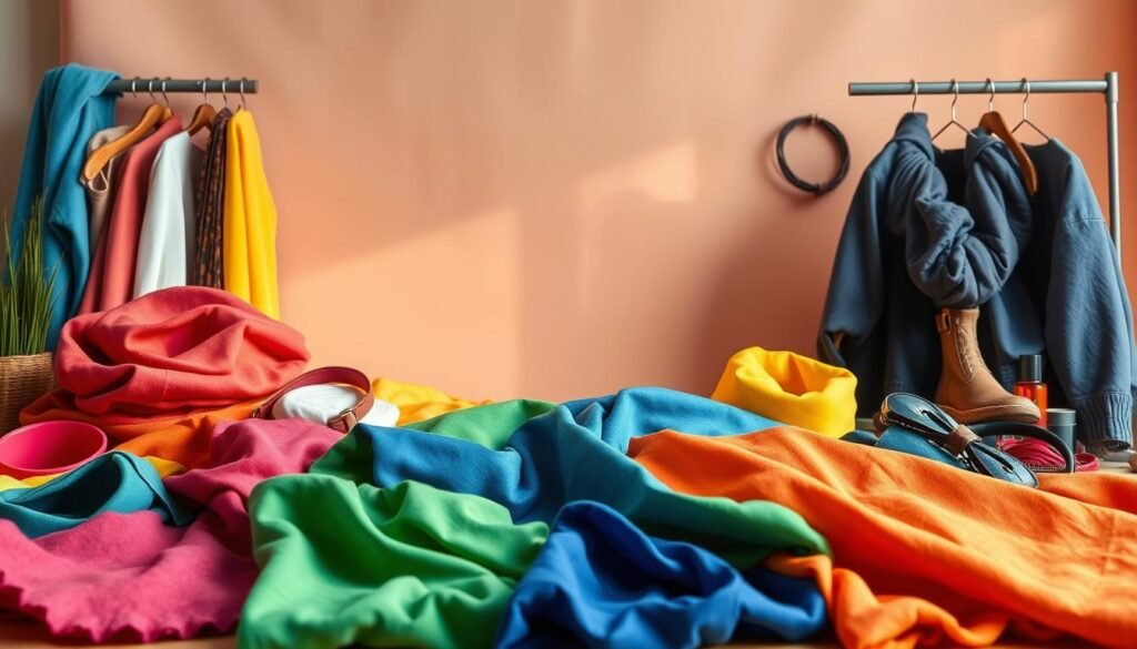
Learning to create harmonious color schemes is key. Professional stylists use three main approaches every day. These styling tips help you make outfits that look put together and stylish. Whether you’re mixing bold contrasts or soft tones, knowing these techniques changes how you match colors.
Each method has its own benefits for different times and styles. Complementary pairings make a big statement, while analogous schemes offer a calm harmony. Triadic combinations strike a perfect balance between excitement and elegance.
Complementary Color Pairing Techniques
Complementary colors are opposite each other on the color wheel, creating strong contrast. Classic pairs include red with green, blue with orange, and purple with yellow. These combinations grab attention and add energy to your outfits.
For successful complementary color matching, balance is key. Use one color as the main focus and the other as an accent. For example, wear a navy blue dress with orange accessories, or pair a forest green blazer with burgundy details.
If bright contrasts are too much, start with muted versions. Dusty rose and sage green make a softer pair. Coral and teal are also good for beginners.
Building Analogous Color Schemes
Analogous colors are next to each other on the color wheel, creating harmonious combinations. These styling tips are great for creating looks that are both cohesive and sophisticated. Think of blue, blue-green, and green, or red, red-orange, and orange.
Choose a primary color and use the next ones as supporting colors. A royal blue top looks good with navy pants and a teal scarf. This approach adds depth without harsh contrasts.
Analogous schemes are perfect for work and daytime events. They look polished and intentional while being easy on the eyes. Vary the intensity of your colors to add interest without losing harmony.
Mastering Triadic Color Combinations
Triadic color schemes use three colors spaced equally on the color wheel, creating lively yet balanced looks. Popular sets include red, yellow, and blue, or orange, green, and purple. These combinations offer more depth than complementary pairings.
Use the 60-30-10 rule for triadic color matching. Choose one color for 60% of your outfit, the second for 30%, and the third as a 10% accent. This keeps the look balanced and interesting.
Start with softer versions of triadic colors to build confidence. Dusty pink, sage green, and cream make a gentle scheme. Burgundy, navy, and gold are more sophisticated for formal events.
Practice these techniques with what you already have before buying new. Mix and match your clothes to find what works best for you.
Mastering Monochromatic Outfit Coordination
Single-color styling brings elegance and simplicity to daily outfits. It makes planning outfits easy and stylish. Monochromatic dressing uses different shades of one color to add depth and beauty.
This method is simple and versatile. It works for casual days or professional events. Most importantly, it makes outfits look intentional and polished.
Selecting Different Shades and Tones
To create great monochromatic looks, mix different shades of the same color. Choose 2-3 different shades with the same base color. This adds interest without clashing colors.
Light, medium, and dark shades of your color work well together. For example, use powder blue, sky blue, and navy for a blue outfit. The goal is to have enough contrast to show each piece clearly.
Higher contrast makes outfits more formal. Lower contrast is better for casual looks. Choose shades based on the event and how formal you want to look.
Follow the 60-30-10 rule in monochromatic styling. Use the lightest shade for 60%, medium for 30%, and darkest for 10%. This balances your outfit and flatters your shape.
Adding Visual Interest with Textures and Fabrics
Texture variation keeps monochromatic outfits interesting. Mix different fabrics to add dimensional appeal. This makes your fashion coordination more sophisticated.
Pair smooth and textured materials for impact. Try a silk blouse with wool pants, or a cotton sweater with leather accessories. These contrasts add depth while keeping colors in harmony.
Think about fabric weights and finishes when styling. Heavy materials like denim pair well with lighter ones like chiffon. Matte finishes balance shiny ones for a complete outfit colors coordination.
Patterns can enhance monochromatic outfits if used right. Opt for subtle patterns like pinstripes or small polka dots. These add interest without breaking the single-color rule.
Accessories are key in monochromatic styling. Use different textures in shoes, bags, and jewelry. Remember, varying textures add the interest that solid color blocking might lack.
Advanced Color Matching Techniques for Pattern Mixing
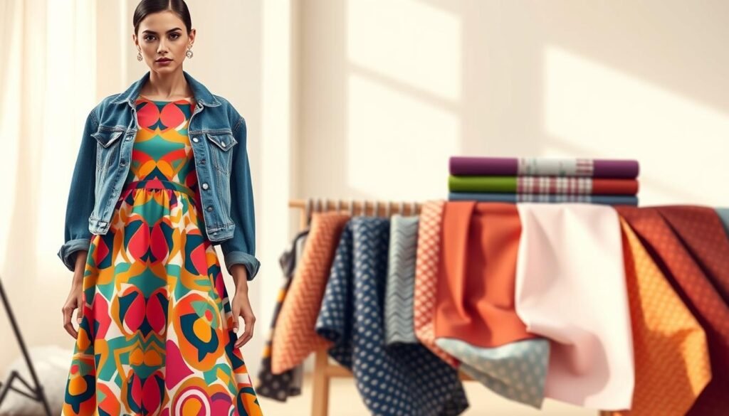
Mixing patterns in a way that looks good is an art. It’s about making sure different prints work well together. Successful pattern mixing means finding the right balance between bold designs and colors that match.
Learning these advanced styling tips opens up new ways to create unique outfits. The trick is to find common colors in different patterns.
Coordinating Colors Across Multiple Patterns
To find harmony, look for shared colors in each pattern. Even a small color can connect them. This color bridge helps your outfit look cohesive.
Here are some color matching strategies:
- Pick one dominant color that appears in all patterns you’re mixing
- Use different intensities of the same color family across patterns
- Match undertones for a sophisticated look
- Incorporate neutral patterns to ground brighter designs
It’s also important to match temperature tones. Mixing warm and cool tones can work if done on purpose.
Balancing Bold Prints with Solid Colors
Bold prints need balance to avoid overwhelming your look. Solid colors help by creating space between patterns. Solid pieces act as visual anchors that keep your outfit grounded.
Here’s how to balance your look:
- Start with your boldest pattern as the focal point
- Add one smaller-scale pattern in a complementary design
- Include solid colors that match minor colors in your patterns
- Use accessories in solid colors to tie everything together
Solid colors don’t have to be boring. Rich jewel tones or vibrant colors can add beauty when they match your patterns.
Scale and Proportion Guidelines for Pattern Combinations
Using different scales prevents patterns from fighting for attention. Mixing patterns of similar sizes can look busy. Instead, mix different scales for a professional look.
Large-scale patterns are best as statement pieces. Smaller patterns add details. A bold floral top looks great with thin pinstripes or small polka dots.
Here are some guidelines for scale:
- Pair large prints with small or medium-scale patterns
- Limit yourself to three different pattern scales maximum
- Use the largest pattern on your most flattering body area
- Balance busy patterns with simpler geometric designs
These techniques make pattern mixing exciting. With practice, you’ll know which combinations work well together.
Seasonal Fashion Coordination and Color Choices
The changing seasons are a great time to update your fashion coordination with nature’s colors. Each season has its own vibe, which you can capture with the right colors. Knowing about seasonal color theory helps you make outfits that match the world around you.
The four-season color analysis system links your undertones with seasonal colors. Fall and spring colors are great for warm undertones, while winter and summer fit cool undertones well. This system helps find your best outfit colors for each season.
You don’t need to change your whole wardrobe with the seasons. Just adjust your color choices while keeping pieces that are always in style. Neutral colors stay the same, and you add seasonal colors as accents.
Spring and Summer Color Palettes
Spring colors are full of life and energy, with warm, bright, and pastel hues that show nature’s awakening. These colors are perfect for those with warm undertones who want to feel the season’s optimism.
Key spring colors include:
- Sunny yellows that brighten any complexion
- Fresh greens from mint to grass green
- Vibrant oranges and coral tones
- Soft pastels like peach and lavender
Summer colors are cooler but keep the lightness and freshness. These outfit colors are great for cool undertones and make stylish yet easy looks.
Summer essentials feature:
- French blue and powder blue shades
- Smokey purples and soft lilacs
- Berry reds and dusty pinks
- Mint green and sage tones
Both spring and summer palettes are lighter and softer. These colors reflect more light, keeping you cool while looking polished in warmer months.
Fall and Winter Color Combinations
Fall colors are inspired by changing leaves and harvest time, creating warm palettes for cozy weather fashion coordination. These deeper tones are perfect for warm undertones and make sophisticated autumn looks.
Fall favorites include:
- Deep burgundy and wine shades
- Golden yellows and burnt orange
- Forest green and olive tones
- Rich browns from camel to chocolate
Winter colors are bold and clear, complementing cool undertones. These outfit colors make striking looks that stand out against winter’s muted backdrop.
Winter powerhouses feature:
- True red and deep crimson
- Royal blue and navy
- Emerald green and pine
- Classic black and crisp white
Fall and winter colors are deeper and darker than spring and summer. This creates a cozy, grounded feeling that matches cooler weather.
The best color in the whole world is the one that looks good on you.
Remember, seasonal fashion coordination should enhance your natural coloring, not fight against it. Use these guidelines as starting points, then adjust based on what makes you feel confident and beautiful all year.
Professional Color Coordination for Work and Formal Events

Choosing the right colors is key to professional dressing. It shows respect and style. Your clothes speak before you do, making color matching vital for success.
Workplaces need a mix of conformity and creativity. The right colors boost your credibility and confidence. They help you stand out positively at meetings, interviews, or formal events.
Business Appropriate Color Schemes
Navy blue is a top choice for work clothes, showing trust and skill. It pairs well with whites, grays, and soft pastels. Classic navy looks authoritative yet friendly.
Charcoal gray is another great neutral for all seasons. It matches well with emerald green or sapphire blue for a touch of elegance. These styling tips help your wardrobe fit any business setting.
Earth tones like taupe and camel offer a professional yet less formal option. They’re perfect for creative fields. Burgundy and forest green are also great for adding sophistication.
Learning about colour theory for workwear helps you choose the right colors. Stay away from bright or neon colors in conservative settings. They can distract from your message.
Formal Occasion Color Matching Guidelines
At black-tie events, stick to classic colors like black, navy, or midnight blue. Women can use deep jewel tones and metallics. Color matching is key for accessories and shoes.
Cocktail events let you be more creative while staying classy. Rich colors like purple, green, and red make a strong impression. These events are great for showing your color coordination skills.
Award ceremonies and galas allow for bolder choices. But, be careful not to overdo it. Metallics like gold and silver add glamour. Choose darker colors for evening events.
When choosing wedding guest attire, be mindful of the couple’s colors. Soft pastels and muted jewel tones are respectful yet stylish. Avoid white and colors that might clash with the bridal party.
Adding Personality to Professional Outfits
Accessories are a great way to add your personal touch to work clothes. A colorful scarf or vibrant jewelry can make a basic outfit stand out. These styling tips help you stay professional while showing your personality.
Shoes and handbags are also great for adding color. A burgundy briefcase or emerald green pumps can add sophistication. Quality accessories in unexpected colors show you pay attention to detail.
Subtle patterns and textures add interest without being too bold. A navy blazer with pinstripes or a textured blouse adds depth. These elements show creativity and attention to detail.
Changing your colors with the seasons keeps your wardrobe fresh. Lighter colors for spring and summer, deeper colors for fall and winter. This ensures your wardrobe stays current and professional.
Feeling confident in your clothes starts with wearing what makes you feel good. When your colors match your skin and personality, you naturally seem more confident. These color coordination principles are key to your career success.
Casual Color Styling Tips for Everyday Confidence
Casual color coordination lets you have fun with fashion. It’s different from professional settings where you need to be more careful. These styling tips will help you express yourself through colors that show your personality.
Casual dressing is all about being flexible. You can try bold combinations that are too bold for work. Start with something you love, like a bright sweater or blue sneakers.
Even though it’s casual, you want to look good and feel comfortable. Colors help you achieve style and confidence every day.
Weekend Color Combination Ideas
Weekends are great for trying out outfit colors that make you happy. Mix colors in ways that might surprise you. For example, a yellow top with navy jeans is perfect for brunch.
Here are some weekend color ideas:
- Coral and mint green – Fresh and playful for outdoor activities
- Burgundy and mustard – Rich and cozy for casual dinners
- Lavender and sage green – Soft and sophisticated for coffee dates
- Terracotta and cream – Earthy and warm for farmers market visits
Denim is great as a neutral base. It goes well with many colors, making it easy to try new things. A pink sweater with blue jeans is stylish yet easy to wear.
For errands, try monochromatic looks in different shades of the same color. A green outfit in various shades is interesting and easy to coordinate.
Incorporating Statement Colors into Casual Looks
Statement colors add personality without being too much. Pick one bold color and pair it with neutrals or similar colors. A red jacket with white jeans and tan accessories is a great look.
If bold colors scare you, start with accessories:
- Colorful sneakers – Instantly update any neutral outfit
- Vibrant handbags – Add personality to simple jeans and tees
- Bold scarves – Transform basic outfits with minimal effort
- Statement jewelry – Bring color close to your face for a flattering effect
As you get more confident, try bigger statement pieces. A blue sweater or green pants can be your signature look. The key is to wear them with confidence and style.
Think about where you’re going when choosing statement colors. A neon pink top is great for weekends but might not fit a family dinner. Choose colors that make you feel like yourself.
Confidence is the best accessory. When you feel good in what you’re wearing, it shows. These tips help you find colors that fit your lifestyle and style.
Building a Color-Coordinated Capsule Wardrobe
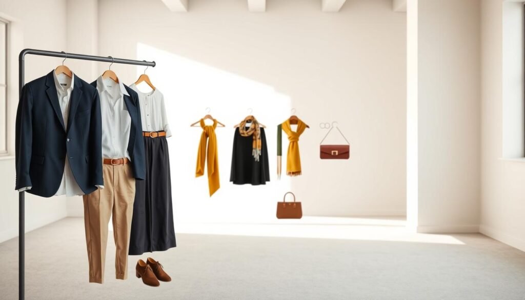
Creating a color-coordinated capsule wardrobe makes getting dressed easier and boosts your style. It’s about smart fashion coordination and planning. This way, you have many outfit options with fewer items.
Choosing items wisely is key, not just buying whatever catches your eye. Knowing how colors work in your wardrobe helps you make smart buys. This saves money, time, and space in your closet, and you always look great.
Selecting a Core Color Palette
Your core color palette is the base of your color matching wardrobe. Pick three to five colors that look good on you and fit your lifestyle. These colors will be in many of your pieces.
Think about your daily life when picking colors. For a conservative job, navy, gray, or black are good choices. Add one or two colors that show your personality. Popular palettes include navy-white-camel, black-gray-burgundy, or olive-cream-rust.
Try out your colors together before buying. Lay out fabrics or pieces to see if they look good together. Your palette should have both warm and cool tones for all seasons.
Essential Pieces in Each Color Family
Shopping smart means getting key pieces in each color. This makes every item useful in many outfits. Fashion coordination becomes easy when each piece fits with others.
Start with neutral pieces. They are the base of your wardrobe and offer many mixing options. Add accent pieces slowly, focusing on versatile items for different occasions.
| Color Family | Essential Pieces | Styling Function | Outfit Combinations |
|---|---|---|---|
| Primary Neutral | Blazer, trousers, dress | Foundation pieces | Works with all colors |
| Secondary Neutral | Blouse, cardigan, skirt | Layering options | Bridges color gaps |
| Accent Color 1 | Top, scarf, shoes | Adds personality | Creates focal points |
| Accent Color 2 | Sweater, bag, jewelry | Seasonal variety | Refreshes basic looks |
Quality is more important than quantity in a capsule wardrobe. Spend on well-made items in your core colors, not trendy ones. Each piece should be worth it by working with at least three others.
Maximizing Outfit Combinations with Strategic Color Choices
Smart color matching increases your outfit options a lot. With every piece coordinating with others, a small wardrobe can make many outfits. This new way of thinking about clothes is a game-changer.
Use math to figure out your outfit possibilities. If you have five tops and four bottoms, you have twenty outfits. Add layers and accessories in matching colors to make even more.
Make outfit formulas using your color palette. For example, a neutral base plus an accent color plus metallic accessory is a good template. Swap pieces in the same color families to make new outfits without starting over.
Take photos of outfits that work well together to make mornings easier. Note which colors and pieces look best together. This system helps you avoid guessing and boosts your fashion coordination confidence.
Remember, color choices are not just for clothes but also for accessories and shoes. When these match your core palette, they enhance every outfit. This approach makes your whole wardrobe work together seamlessly.
Troubleshooting Common Color Matching Mistakes
Knowing how to spot and fix color coordination issues is key to boosting your style confidence. Even seasoned fashion lovers can sometimes put together outfits that don’t quite match. Luckily, most fashion coordination problems have simple fixes once you know what to look for.
Learning to identify these common mistakes can change how you get dressed. You’ll learn to create outfits that feel balanced and polished, making every choice intentional.
Avoiding Color Overload in Your Outfits
Color overload occurs when you mix too many colors in one outfit. This creates a mess that overwhelms your look. Less is often more when it comes to color coordination.
Signs of color overload include feeling like your outfit is too busy or hard to focus on. If this happens, take a step back and find your main color. Then, remove one or two colors to give your outfit some space.
Limiting yourself to three colors is a good rule. Pick one main color, one supporting color, and one accent color. This creates a clear visual hierarchy while keeping your outfit interesting and sophisticated.
“The secret to great style isn’t wearing every color you love—it’s choosing the right colors that work together beautifully.”
Fixing Clashing Color Combinations
Clashing colors fight for attention instead of working together. Common mistakes include mixing warm and cool tones without a bridge, or pairing colors with similar intensity levels.
To fix clashing colors, try these styling tips. First, use a neutral like white, black, or gray to separate colors. This gives each color its own space.
Another trick is to adjust the intensity of colors. If two bright colors clash, swap one for a muted version of the same color. This keeps your color story while balancing the look.
When Good Colors Go Wrong
Sometimes, even perfect color combinations don’t work in real life. This can be due to fabric texture, lighting, or personal coloring issues that theory doesn’t cover.
Trust your gut if something feels off, even if it looks good on paper. Your undertones, body shape, and lifestyle affect how colors look on you. What works for someone else might need tweaking for you.
The solution is to make small changes, not big overhauls. Try adjusting the color proportions, swapping dominant and accent colors, or adding a different neutral. These small tweaks can make a big difference.
Remember, mastering fashion coordination takes practice. Every mistake teaches you something about your style and what works for you.
Conclusion
Learning to match colors changes how you pick outfits every day. The skills you’ve picked up help you create looks that show off your style. They also follow color theory rules.
Begin by trying out one new color mix each week. Start with a neutral color and add ones that look good with your skin. Getting better at picking colors takes practice.
Being confident is key when wearing any color mix. Listen to your gut when using these color matching tips. The 60-30-10 rule helps, but your own taste is just as important.
Building a wardrobe that matches colors takes time. Focus on getting pieces that go with many colors in your palette. This way, you have more outfit choices and your style stays consistent.
Your unique style comes from mixing color theory with your own flair. Sometimes, the best looks come from breaking the rules. Use what you’ve learned to make outfits that make you feel good and true to yourself.
Color matching opens up a world of creative possibilities. Every time you make a great outfit, you get better and feel more stylish.

