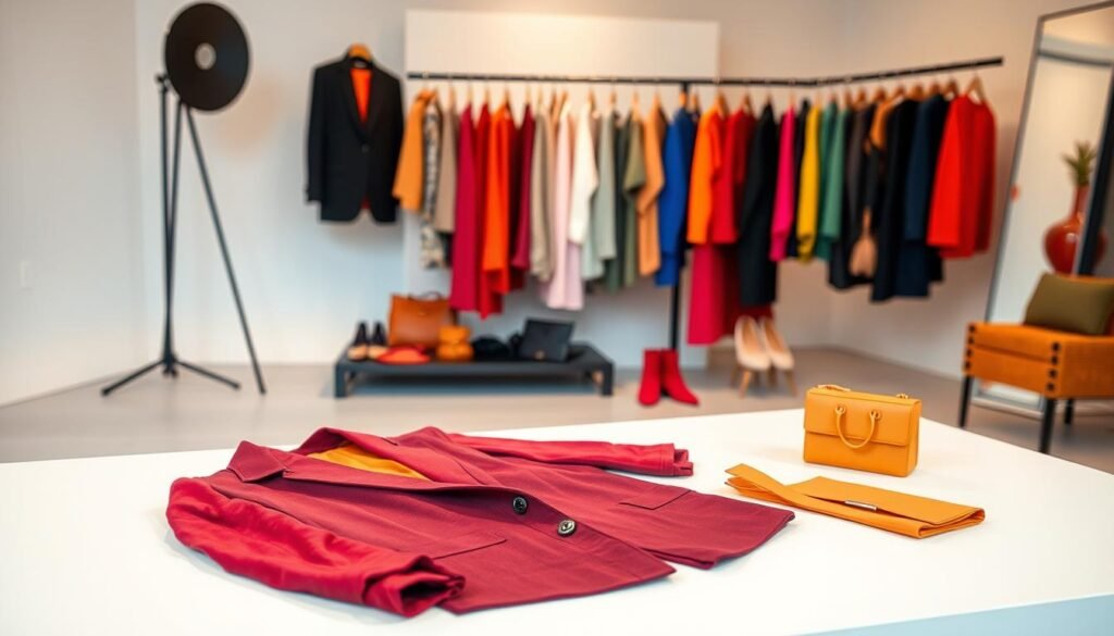
“Fashion is not something that exists in dresses only. Fashion is in the sky, in the street, fashion has to do with ideas, the way we live, what is happening,” said Coco Chanel. This timeless wisdom is key to color coordination in your daily outfits.
The art of fashion color matching is more than just avoiding clashing patterns. It’s about telling a visual story that shows your personality and beauty. Learning the basics of outfit styling lets you turn simple pieces into stunning outfits.
Smart wardrobe harmony can make your best features stand out while fitting your skin tone. The right colors boost your confidence, whether for a business meeting or a casual brunch. Knowing these rules helps you make choices that send the message you want.
Every color has its own story. Learning to speak this visual language can take your style to the next level.
Key Takeaways
- Proper color coordination enhances your natural features and flatters different skin tones
- Strategic fashion color matching creates visual interest and sophisticated outfit combinations
- Mastering wardrobe harmony helps you express personality through intentional style choices
- Understanding color relationships transforms basic pieces into polished, professional looks
- Thoughtful outfit styling communicates confidence and attention to detail
- Color theory knowledge empowers you to make bold yet harmonious fashion decisions
Understanding the Fundamentals of Color Theory for Fashion

Color theory is key to making smart fashion choices that boost your style. It teaches you why some colors go well together and others don’t. Learning color theory basics changes how you pick outfits every day.
Color relationships are what stylists and designers rely on. You can use these principles to create amazing outfit ideas for any event. This knowledge helps you build a wardrobe that looks great together.
The Color Wheel and Its Fashion Applications
The color wheel shows colors in a circle, based on how they relate to each other. It’s a tool that helps you see how colors work together. Primary colors are at the center, forming the base of all other colors.
Designers use the color wheel to make balanced collections. You can use it to plan outfits just as well. It shows which colors go well together and which create a bold contrast.
Primary, Secondary, and Tertiary Colors in Clothing
Primary colors are red, blue, and yellow, which can’t be mixed. Secondary colors are green, orange, and purple, made by mixing two primaries. Tertiary colors are created by mixing primary and secondary colors.
| Color Category | Examples | Fashion Applications | Styling Impact |
|---|---|---|---|
| Primary | Red, Blue, Yellow | Statement pieces, bold accents | Creates strong focal points |
| Secondary | Green, Orange, Purple | Seasonal pieces, creative looks | Adds visual interest |
| Tertiary | Red-orange, Blue-green | Sophisticated neutrals | Provides subtle depth |
Knowing these color types helps you choose colors wisely. Each type has its own role in your wardrobe. Styling tips often focus on mixing these colors well.
Warm vs Cool Undertones in Your Wardrobe
Warm colors like reds, oranges, and yellows are energetic and sunny. Cool colors like blues, greens, and purples are calming and refreshing. These colors affect how they look with your skin and energy.
Warm undertones look good with gold jewelry and earthy accessories. Cool undertones match silver metals and jewel-toned accents. Knowing your undertone helps you choose colors that look great together.
Building Your Personal Color Palette Foundation

Effortless style comes from a personalized color system that shows who you are. It starts with finding colors that look good with your features. This foundation makes shopping easier and more confident.
Creating your personal styling journey involves three key steps. First, find out your skin’s undertone. Then, pick neutral colors that go with everything. Lastly, choose accent colors that show your style.
Identifying Your Skin’s Undertone
Knowing your skin’s undertone is key for skin tone analysis. The vein test is a simple way to start. Look at your wrist veins in natural light. Green veins mean warm undertones, while blue or purple veins are cool.
The jewelry test is another good method. See if gold or silver jewelry looks better on you. Gold suits warm undertones, and silver suits cool ones. If you look good in both, you might have neutral undertones.
Selecting Your Core Neutral Colors
Your neutral colors are the heart of your wardrobe. These wardrobe basics include black, white, gray, navy, and beige. Warm undertones look great with cream, camel, and warm grays. Cool undertones shine in true white, charcoal, and cool grays.
Pick three to four neutral shades that go well together. This lets you mix and match while keeping your look cohesive.
Choosing Your Signature Accent Colors
Accent colors add personality to your outfits. Choose two to three colors that match your undertones and style. For cool undertones, try jewel tones. Warm undertones look good in earthy shades.
| Undertone Type | Best Neutrals | Ideal Accent Colors | Colors to Avoid |
|---|---|---|---|
| Warm | Cream, Camel, Warm Gray | Coral, Mustard, Olive Green | Icy Blue, Bright White |
| Cool | True White, Charcoal, Navy | Emerald, Royal Blue, Fuchsia | Orange, Yellow-Green |
| Neutral | Off-White, Taupe, Medium Gray | Soft Pink, Teal, Burgundy | Extremely Bright Colors |
Test accent colors by holding fabric swatches near your face in natural light. The right colors will brighten your skin. The wrong ones might make you look tired.
Mastering Color Coordination Techniques for Beginners
Four key ways to fashion color matching can change your wardrobe. These beginner techniques help you make stunning outfits with ease. Each method guides you to color harmony in your daily style.
The Monochromatic Approach
Monochromatic dressing uses different shades of one color for elegant looks. It mixes various shades, tints, and tones of the same color in your outfit.
Begin with a color family like navy blue. Wear a dark navy blazer with lighter blue jeans and a pale blue shirt. Mix different fabrics to add depth to your look.
This method is great for beginners. It’s easy because you only need to focus on one color family. This builds your confidence in styling.
Complementary Color Combinations
Complementary colors are opposite each other on the color wheel. They create striking contrasts, like blue and orange, or red and green.
Use one color as the main focus and the other as an accent. A navy dress with orange accessories works well. Or, choose a forest green top with small red details. This balance prevents the look from feeling too much.
These bold combinations are perfect for making a statement while staying professional.
Analogous Color Schemes
Analogous colors are next to each other on the color wheel. They create harmonious combinations because they share undertones.
Try pairing blue with purple and green, or yellow with orange and red. These combinations are easy and pleasing. A teal blouse with navy pants and emerald accessories is a sophisticated choice.
This method offers variety and is easy for beginners to master.
The 60-30-10 Rule for Balanced Outfits
This rule ensures balanced outfits. Use 60% of your outfit for one color, 30% for a secondary shade, and 10% for an accent color.
For example, wear black pants and a black blazer (60%), a white shirt (30%), and red shoes or accessories (10%). This keeps your look balanced.
Stylists use this rule for polished, intentional outfits. These outfits look great in photos and make a strong impression.
Creating Visual Depth Through Strategic Color Placement

Using colors smartly can turn simple outfits into eye-catching, three-dimensional looks. Colors and light play together to create stunning effects. This can make your outfit look better and more sophisticated.
Stylists use color placement to add depth to outfits. They place colors in certain spots to change how we see shapes and sizes. This makes the outfit look polished and put together.
Using Dark Colors to Create Shadows and Definition
Dark colors pull back from the eye, making them great for depth and definition. Navy, charcoal, deep burgundy, and black work like shadows. They can slim down areas and add structure to your look.
Wearing a dark blazer over a light top can slim your waist. The dark layer creates a shadow effect that draws the eye in. This trick is great for making your waist look smaller, no matter your shape.
Light Colors for Highlighting and Expansion
Light colors move forward, making things look bigger and brighter. Whites, pastels, and light neutrals draw attention and highlight your best features. This helps guide the eye where you want it.
Light colors can balance out dark parts of your outfit. A white shirt under a dark jacket adds contrast and keeps the look light. Light accessories like scarves or shoes can also draw the eye and add interest.
Color Blocking Techniques for Dimensional Looks
Color blocking uses solid colors to add modern interest. It pairs contrasting or complementary colors in clean sections. The sharp color changes create visual depth through optical contrast.
Start with simple two-color combos and then try more complex ones. A navy top with bright coral pants is a striking combination. This method is perfect for casual or creative settings where you want to make a bold statement.
Advanced Color Mixing Strategies for Sophisticated Looks

Professional stylists use sophisticated fashion techniques that go beyond simple colors. These advanced techniques make outfits look striking and balanced. Learning these methods can turn your clothes into expertly matched outfits.
Understanding how colors work together is key. Stylists focus on balance and flow, not just rules.
Triadic Color Combinations
Triadic schemes use three colors that are evenly spaced on the color wheel. This makes outfits vibrant and balanced. Pick one color as the main one and use the others as accents.
For example, mix navy blue, coral, and golden yellow. Wear navy as your main piece, add coral accessories, and golden yellow details. This color mixing creates interest without being too much.
Split-Complementary Schemes
Split-complementary schemes offer a nuanced way to dress. Choose a base color and the two colors next to its complement. This creates strong contrast without being too harsh.
For instance, if blue is your base, pair it with red-orange and yellow-orange. This method adds sophisticated contrast that’s easy to wear every day.
Working with Metallics and Neutrals
Metallics and neutrals mix colors smoothly. Gold goes with warm tones, silver with cool colors. Bronze works well with earth and jewel tones.
Use metallics as accents. A gold belt can link burgundy and forest green. Silver jewelry pairs navy and gray well. These add luxury while keeping colors in harmony.
Incorporating Patterns and Prints
Mixing patterns needs careful color mixing. Start with patterns that share colors. Mix different sizes, like large florals with small stripes or dots.
“The secret to mixing patterns is ensuring they share at least one common color thread that ties the entire look together.”
| Color Scheme | Best Applications | Difficulty Level | Key Benefits |
|---|---|---|---|
| Triadic | Casual to semi-formal | Intermediate | High impact, balanced |
| Split-Complementary | Professional settings | Advanced | Sophisticated contrast |
| Metallic Integration | All occasions | Beginner | Instant elegance |
| Pattern Mixing | Creative environments | Expert | Personal expression |
These advanced techniques need practice but pay off big. Start with one and add more as you get better. Remember, the key to sophisticated fashion is understanding these principles, not just following them.
Seasonal Color Coordination Approaches

The changing seasons give you a chance to update your color palette and style. Seasonal fashion follows nature’s cycle, making outfits feel right on time. Knowing how colors change with the seasons helps you plan your wardrobe better.
Each season has its own vibe and mood. This natural cycle guides which colors look best at different times.
Bright Palettes for Warmer Months
Spring brings soft, fresh colors to your wardrobe. Think of blush pink, mint green, and sky blue, like blooming flowers and clear skies. These colors are perfect for casual days and work outfits.
Summer is all about vibrant, energetic hues. Coral, turquoise, and sunny yellow make stunning outfits. These colors capture summer’s fun spirit and look great on sun-kissed skin.
Rich Tones for Cooler Seasons
Fall is all about earthy, sophisticated colors. Think rust orange, deep red, and olive green, like changing leaves. These colors add warmth and depth to your outfits, working well from day to night.
Winter calls for cool, crisp colors. Navy blue, emerald green, and icy gray create elegant outfits for the cold months.
Bridging Seasons with Smart Choices
Transitional colors are key for fashion color matching across seasons. Deep burgundy works from fall to winter, while sage green connects summer to autumn.
| Season Transition | Key Colors | Best Pieces | Styling Tips |
|---|---|---|---|
| Summer to Fall | Sage green, warm beige | Lightweight cardigans | Layer over summer basics |
| Fall to Winter | Deep burgundy, charcoal | Wool coats, scarves | Mix with existing autumn pieces |
| Winter to Spring | Soft lavender, cream | Light blazers, silk blouses | Gradually introduce lighter tones |
| Spring to Summer | Coral pink, aqua blue | Cotton dresses, linen tops | Build on spring’s fresh palette |
The best-dressed people know seasonal dressing is about feeling connected to the world around them.
Occasion-Specific Color Coordination Guidelines
Your color choices should change with each occasion. From boardroom meetings to weekend gatherings, knowing how to adjust your colors is key. Different places need different color strategies.
The secret to great event dressing is mixing personal style with the right formality. Think about the lighting, venue, and dress code when picking your colors.
Professional and Business Attire Color Rules
Professional fashion is all about balance. Navy, charcoal gray, and deep burgundy are great for work. They show you’re serious but also let you add your own flair.
Triadic color schemes are perfect for work. Try navy with cream and soft gold for a sharp look. But, avoid very bright colors in conservative places. Instead, add small pops of color with accessories.
Keep your colors not too different in work settings. Very contrasting colors can be too bold for traditional offices.
Casual and Weekend Color Combinations
Weekend styling tips let you play with colors more. Earth tones like olive green and warm browns are great for casual days. They’re relaxed yet stylish.
Analogous color schemes are great for weekends. Blues and greens or warm oranges and reds are fresh and fun. Remember, casual doesn’t mean sloppy – your colors should match well.
Denim is a great base for trying out bolder colors in casual settings.
Evening and Formal Event Color Strategies
Formal events are perfect for bold colors and high contrast. Deep jewel tones like emerald and sapphire make stunning evening looks. They look great under bright lights.
Complementary color schemes are perfect for event dressing at formal events. They create a striking look while staying elegant. Think about how the lighting will change your colors – restaurant lights are warm, while ballroom lights are cool.
Metallics are classy neutrals for evening wear. Gold goes well with warm colors, and silver matches cool tones.
Common Color Coordination Mistakes and How to Avoid Them
Knowing common styling mistakes is key to effortless color coordination. Even seasoned fashion lovers can fall into these traps. Spotting and fixing these errors can greatly improve your style.
Most color coordination problems have simple fixes. Once you know these, you’ll create balanced, harmonious looks. These looks will highlight your natural beauty.
Overwhelming Color Combinations
One big mistake is using too many bold colors in one outfit. This causes visual chaos and weakens your overall look.
Follow the three-color rule to avoid this. Pick a main color, a secondary shade, and a neutral accent. This keeps your outfit cohesive and focused.
Ignoring Your Natural Coloring
Many choose colors based on trends, not what flatters them. This mismatch can make you look washed out or unflattering.
Always think about how colors work with your hair, eyes, and skin. Colors that match your natural features will make you look vibrant and polished, no matter the trend.
Mismatching Undertones
Undertone clashes are a subtle but damaging error. When warm and cool undertones clash, your look can seem off, even if the colors look good together.
Poor Color Balance Distribution
Uneven color distribution can make your outfit look unbalanced. If colors are too heavy on top or bottom, your silhouette can look off.
Use the 60-30-10 rule to balance colors. This rule helps distribute colors evenly, creating harmony and avoiding overwhelming any part of your outfit.
Building Your Color-Confident Style Journey
Your journey to mastering your wardrobe starts with understanding color coordination. It’s both an art and a skill. The techniques you’ve learned lay a strong base for making confident style choices every day.
Fashion color matching becomes easy with practice. Begin with simple monochromatic looks. Then, try out complementary and analogous schemes. Each outfit is a chance to use your new skills.
Building color confidence takes time and trying new things. Your style will grow as you find what truly feels like you. The 60-30-10 rule and color blocking add flair to your outfits.
These tips are best when tailored to your life and taste. For work, stick to subtle colors. For casual days, go bold. Let your outfits show who you are.
Color coordination turns everyday clothes into stylish, intentional outfits. Whether mixing warm and cool tones or using seasonal colors, each choice adds to your style story.
Begin by adding one new color trick each week. See how different colors make you feel. Your clothes will become a way to express yourself creatively, while staying stylish.